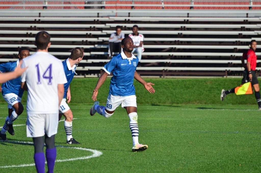
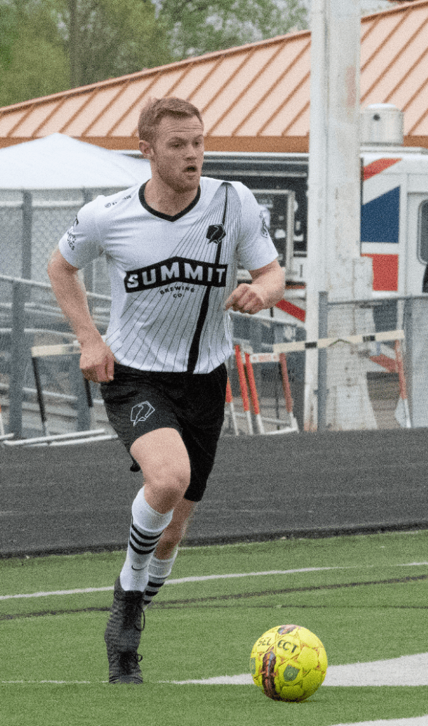
Minneapolis City have great kits.
The Crows’ focus on stand-out design when it comes to their kit helped to create the interest and popularity of the team. It is interesting to see how leading edge the club has been. Hopefully some of these classics go on sale again.
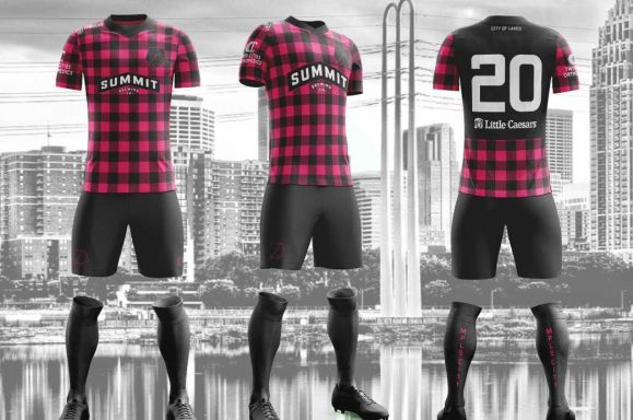
2016-2017
THE INAUGURAL KIT
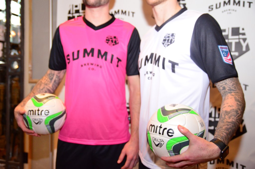
There was a time when pink wasn’t the hot color in soccer.
Then Minneapolis City started playing in pink.
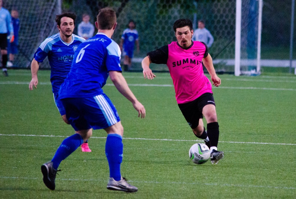
Now, pink is the hot color.
This isn’t to say that that the pink craze was all the doing of a small club from Minnesota, but it was launched at the very beginning of a trend and the hot pink and black give off the punk rock vibe of a club that wanted to do something different.
Beyond the pink, it is interesting that a club known for its jersey design started off so restrained. We are fans of restrained. The clean lines work. The black sleeves and black shorts are a great combo. Outside of the pink, it’s understated and a sneaky classic that ages well.
THE THROWBACK
This shirt pretty much blew up the internet.
There is so much going for it: the beautiful logo, the tied collar, the sponsor-free front, and the fact that City launched a “throwback” jersey before they had played their first game!

The kit launch explainer was really funny too as City continued mocking the earnest design explainer cliche. It also had Grumpy Cat on it.
2018-2019
THE SABO BRIDGE
It was ironic that the year they launched a shirt design inspired by the Sabo Bridge in South Minneapolis they were forced to play in Osseo.
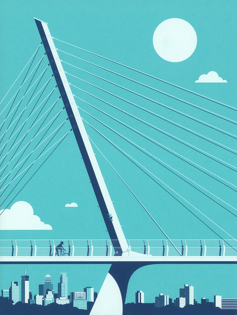
The Crows won the North Conference title both years they wore this design and it is a modern and locally-relevant take on the classic sash shirt design. While it is hard to argue with the results won in this shirt, there is a hint of busyness in the design and an awkwardness from the heavy Summit logo. That is just nitpicking though because the jersey looks outstanding when it’s worn by players celebrating a championship.

HIPSTER PAUL BUNYAN
This is another shirt that pretty much blew up the internet.
The idea is so simple. Of course, the team from Minneapolis would embrace Paul Bunyan and of course they would give the design a hipster twist. In a conference made up of mostly outstate clubs it’s a perfect piece of tongue-in-cheek humor from a club that is all tongue-in-cheek humor.
This shirt is another one that looks great winning a title.

MURDER SLEEVES
The power is in the name, though the design is on point too.

It’s a goalkeeper shirt and goalkeeper shirts, while often cool in a crazy way, are never really classics. Until this one.
CITY OF LAKES
Whatever the kit equivalent of vaporware is, this may be it.
It was launched with some fanfare and a live event in the spring and seemed to be a replacement for the Throwback Kit. The club even hinted that it would wear the kit when Duluth visited, which was a joke because both Duluth’s home and away shirt were blue. It was a joke that everyone wanted to see become real life. It didn’t.

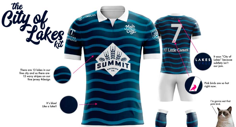
Despite not being worn so far in a competitive game, it’s a pretty kit.
2020
PUT A BIRD ON IT
The newest home jersey for the Crows has, you guessed it, a Crow wing on it.
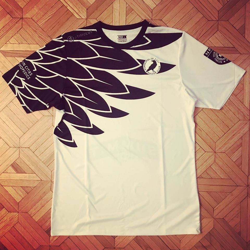
This is a clean, lovable design by designer Matthew Wolff and fulfills the request from fans from the local MLS team for a jersey with a wing on it. The magic here is in executing such a striking look without it seeming derivative of the famous gray and black Loon shirt from United’s NASL days.
ALADDIN SANE
Full disclosure, this is the kit that everyone but Tyler voted for.
This is how you do a white jersey Minneapolis City-style. Yes, it has echoes of Bowie in his Aladdin Sane phase, but the buoyancy, color and originality of the design set it apart. We have to see it in real life, but there is serious potential for greatness here.
It is great that the UPSL team will wear it because it deserves to be one of the classics.
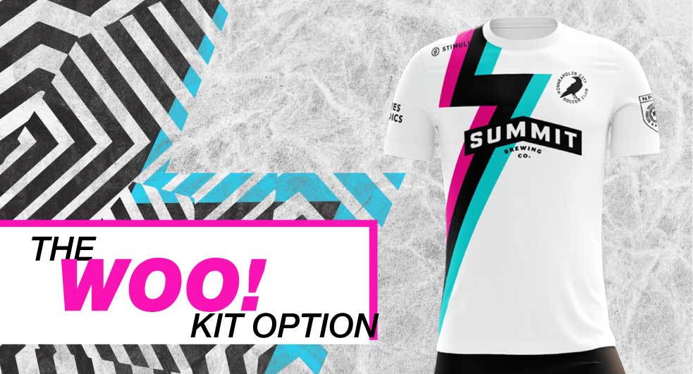
RETINA BLASTER
There is a touch of Miami Vice in the Crows’ new away kit.
The club advertised it as a blast to the retina and given the neon colors they were not lying. This takes advantage of all of the opportunity to do different things that an away kit gives a club and retains the pink that will hopefully become as iconic an away color as yellow has become for Arsenal. Tradition is important, especially for such a young club.

It is also interesting to see how the club’s “dazzle” graphic design style has been pulled into the kit. Maybe it’s a sign that it will be a style element for years to come. It’s different! It grows on you, too. We are bigger fans more every time we see it.
