To branding experts, the logo is a sacred thing. You are only supposed to have one main logo and maybe a secondary logo for use in special cases. You are not supposed to change it, unless you slowly evolve it over the years.
Brands are definitely not supposed to have multiple active logos as part of a rotating cast of logo and logo-like graphics that you use to represent your brand.
Minneapolis City has thrown that received wisdom out the window. In five years the club has had at least four logos and seems to revel in challenging the status quo, even the status quo of branding.
I spoke to co-founder Dan Hoedeman about the club’s logo history to understand the what and the why of the Crows’ brand marks.
Before you even played a game, you launched a second logo: the “throwback” logo. Why did you do that and why did it never become your primary logo?
We were just weeks from introducing our actual logo and we had the design, the branding, the launch graphics, the jerseys, everything was all done, when we met Matthew Wolff.
Matthew is a pretty famous and very awesome designer who has carved out a little niche in the soccer world. He does logos, branding, kit design and more, and he has worked on some iconic clubs from his time and Nike and as a freelancer. Just check out his portfolio.
Anyway, he is from Minneapolis. He actually went to high school with Aaron Olson. He’s a big soccer fan and, long story short, he was interested in helping and we definitely wanted his help but we couldn’t just change everything we had in progress. So, over some beers on a patio in St. Anthony, we got the idea to do the throwback thing and thought it was pretty funny. Matthew was into it as well and a legend was born.

We ended up using that logo and kit for cup competitions, like the U.S. Open Cup and NPSL Playoffs.
It reminded me of how, a few years ago, the Twins would play home games with the “TC” logo hat and away games with the “M” hat. I always thought that approach was cool. Plus, the guys really liked the idea of being able to break out the special kit for the knockout games and I believe firmly in the look good, play good mantra. So that’s how it happened that the “throwback” logo became our cup logo, and that’s why you still see it.
Let’s talk about the original logo. It was a love it or hate it design. How did you end up choosing it?
We spoke with a number of designers who we knew about a logo. Originally, we had in mind that we would be blue and white because Minneapolis is the City of Lakes, those colors made sense, they look cool on a striped shirt, etc and so on. We got some great options along those lines. Some really nice stuff.
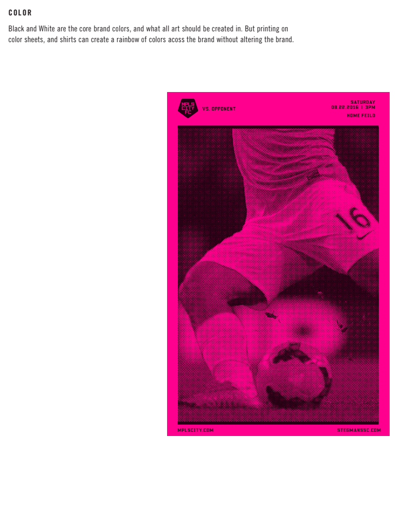
And then Trent Edwards, who worked with Jon Bisswurm and me at Riley Hayes at the time, checked in with this complete brand look that felt like us: kinda punk rock, but tongue and cheek…not really taking it all completely seriously. He was the one who first brought hot pink to the table (and started a trend in soccer). His logo was weird, too. The brief was to do something that would get noticed and it definitely was on brief.


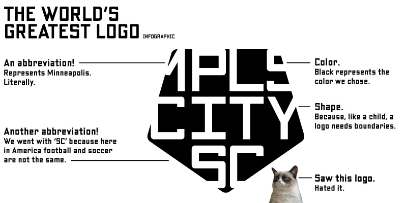
The logo really grows on you. At least it grew on me and the others. I was under no illusions as to what we were going with though, which is why when I did the graphic I included Grumpy Cat. I knew we were going to have some haters and Grumpy Cat just seemed like the perfect riposte.
While a lot of it was going with our gut, we did know that our competitive set–Minnesota United and the other major and minor league sports teams in the Twin Cities–had these professionally, really nicely done logos and brand systems. Having another one wasn’t going to make us stand out. We didn’t want to do a bad logo or brand either and that’s why Trent’s really appealed to us. It was really thoughtful design that hit you in the face like a punk rock poster. It was memorable. It was different. It even won an award–and not only that, but they discontinued the award after we won it because we were the real supreme logo champion.
There was a supporter vote that chose a new logo. Why the change?
When we launched Minneapolis City we wanted to make sure that there was this shared ownership of the club with the supporters, that it was ours.
Anyway, we didn’t have any supporters before we launched and we always thought the
‘fans choose the logo’ gambit from new teams was really hokey. Every team that does that should Boaty McSoccerface as their name and logo. More seriously, the logo and identity of a club should have a connection to the club itself. What’s it about. How it acts. After two years, we felt like we had a little bit of a track record to know what the club was all about and we definitely had supporters so we went for a logo vote. We did have our original logo as one of the choices and it got a fair amount of support, actually.

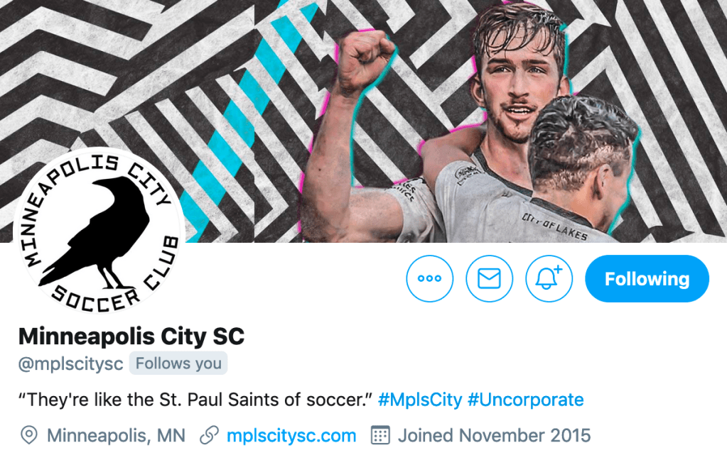
I love the Crow in this one, and we have pulled the Crow out and used it standalone and as part of a pattern in merchandise and online graphics. We didn’t choose our own mascot, that always seemed Super 70’s Sports to me, our supporters started calling us the Crows (and the Grumpy Cats, who says you need only one nickname), but with the Mega Murder in South Minneapolis the Crows really works. Plus, it’s a cool bird and looks good on a logo.
I’ve noticed that the logo that you are using now is slightly different. What changed and why?
When it came time to make the logo work on Twitter, the shapes were a little weird for the circular logo area. To make it fit on Twitter, we made the adjustments you see where we took out the shield/pentagon and wrapped the text in a circle around the Crow. That also worked really well when Facebook adjusted their image area rules so it ended up there.
It ended up turning into a secondary logo of sorts that, because of its shape, ended up working in a lot of environments.
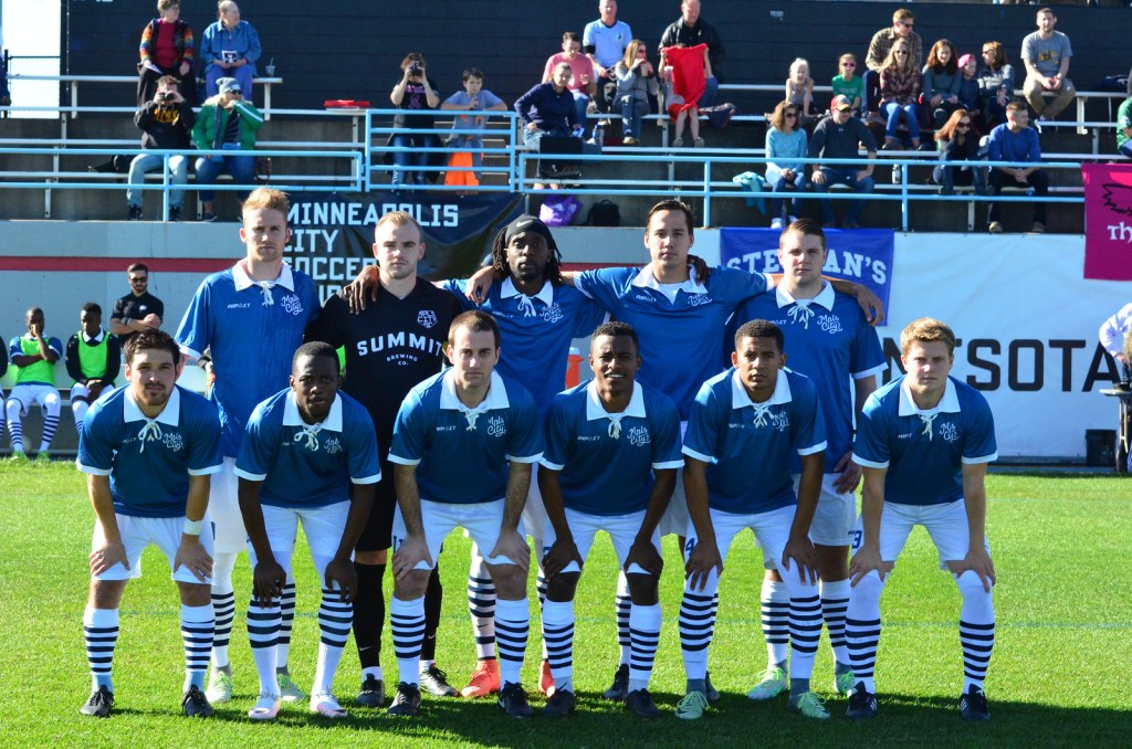
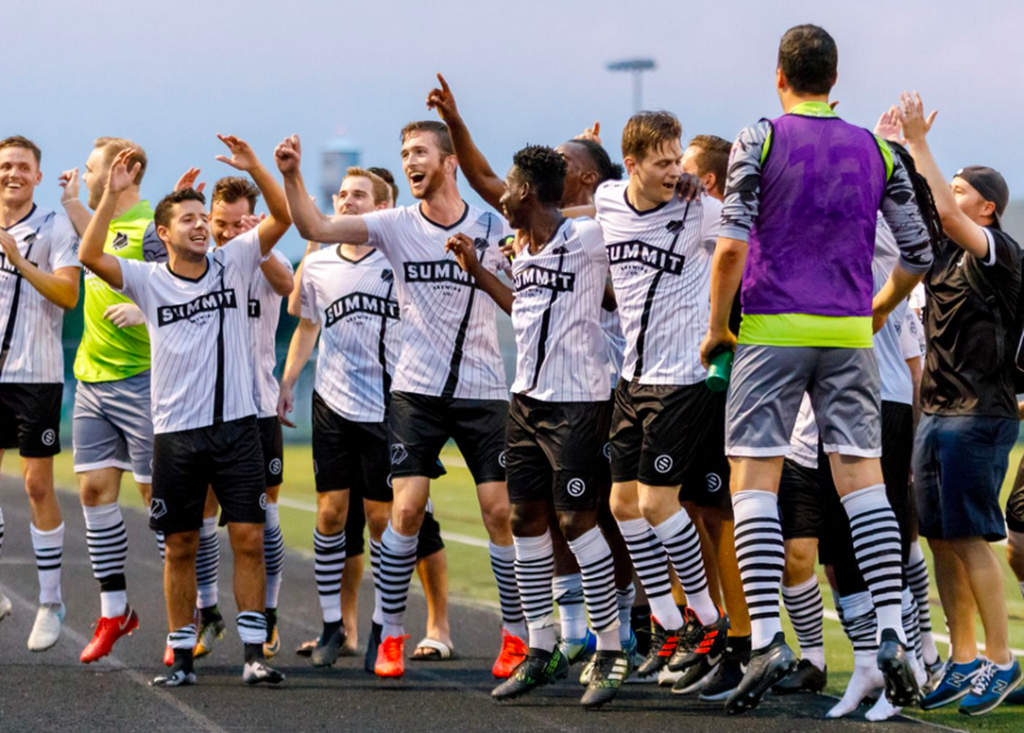
We chose to use it on the jerseys this year because of how it says the name of the club clearly. We sell hundreds of the shirts–if you’re a shirt buyer out there thank you deeply because you help make this club work–and felt like having the name clear was smart branding given how many of them are out there.

Why did you think you could break the rules when it came to logos?
The rules are rules for a reason and in 99% of cases I’ll push for them. We had a case, coming in as an underfunded, lower division challenger in a big league city and had we followed all the rules we wouldn’t have gotten any traction.
Plus, this is soccer. The logos, the kits, the social, it’s all fun. Super fun. Same with the games, the skills of the players, the teams and the trophies. If you’re not having fun, not really enjoying yourself than I’m not sure what you’re doing. Soccer is full of people who take themselves way too seriously. Those people hate us, of course, and that’s fine because we’re over here having a blast and they’re not.
Which is a long way of saying that we did it because we could and because we thought it would be fun.
What should we expect next?
That’s classified. I could tell you, but then I’d have to kill you.
